Algebra
in the Media:
Using
Graphic Representations to Model Media Events
Overview:This
is a lesson plan that would last 2-3 class periods of one hour each.
Students will learn the relationship between graphing in algebra class
and graphs in real life settings portrayed through the media. Students
will then learn to manipulate graphs in order to support their own conclusions
about the data. This will increase their media literacy by teaching
how to distinguish misleading graphs.
Targeted at 8th-10th grade algebra
students: This
activity is targeted for 13-16 year olds who are exposed to newspapers,
magazines, commercials, news reports, and other media sources. Students
should be in algebra class and have a basic understanding of graphing and
different types of graphs. Students, on average, will see graphs
as documents that tell the truth and need not be questioned.
Statement of Objectives:
NCSCOS and Competency Objectives
The student will be able to:
-
Review the slope-intercept form, y=mx+b, scatterplotting ,and making a
line of best fit using calculators and web pages.
-
Graph information using the type of graph that is appropriate in a particular
situation and justify their choice of graph
-
Interpret several different types of graphs found in the media
-
Answer questions about the structure of graphs found in the media
-
Relate Algebra to the media
-
Mimic the process used by media to manipulate data information
Review:
(review graphing the line y=
mx + b where m is the slope
and b is the y-intercept (slope-intercept form). (x,y) are coordinate
points on a continuous graph. use
computer technology to graph equations or access graphing
helper for line graphs or scatterplots--even
instructions for scatterplots on the TI-83.
Review basic scatterplotting
and making a line of best fit.
Learning
to interpret Graphs in Real Life Situations:
*Note to Teacher*
Use this section first in a whole-group
setting--we suggest overheads or handouts of the graphs. Have
the class answer the questions accompanying each graph. The answers
are only examples of the type of answer that is desired.
Optional homework for the first
day (individually): Bring in a graph that relates to your life.
Answer the questions, "Why is this graph important?" "How does this
graph relate to your life?"
The focus of this section is to:
-
See connections between graphs and
their own lives by showing graphs that are relevant to their lives and
are found in the media
-
Realize that graphs are only important
to you if they relate to your life.
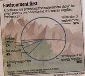 |
What is this graph about?
This graph explains how many Americans in a survey think that protecting
the environment is more important than developing energy supplies.
How does protection of the environment and development of energy
supplies relate to you?
It relates to us because we live in the environment and it is important
to keep it clean so it is a healthy place for us to live. Development
of energy supplies is important because energy is required in order to
live, make a living, go from place to place, and to make money to put back
into the economy.
Is this graph helpful in understanding the subject? Why or
why not?
Yes, it is helpful becuase the graph makes it very easy to see that
more people prefer protecting the environment to developing energy supplies.
We also see that some people have no preference or think both are equally
important.
Does the graph have limitations?
Yes, we don't know exactly what the pollers mean by "protection
of the environment" and "development of energy supplies" but these are
general topics that people have opinions on and the pollers only wanted
to know in general what people think. |
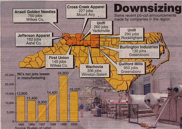 |
What is this graph about? What does the graph mean by "downsizing"?
This graph explains that many companies in our region of North Carolina
are "downsizing" or reducing their number of employees by cutting jobs.
How could the information in the graph affect your life?
It tells me that people in my area are losing their jobs.
My parents or relatives could lose their jobs.
Is this graph helpful in understanding the subject? Why or why not?
The bar graph is helpful because it shows clearly that more people
are losing their jobs than in previous years. |
Misleading
Graphs:
*Note to Teacher*
Use this section next to show that
graphs with important information are sometimes misleading. This
is also a whole-group activity initially. Show the class the differences
in how each graph is misleading (overhead or handouts) and answer the questions
together.
Optional Activity or Homework:
In small groups, find graphs in magazines, newspapers, on the internet,
in commercials, or on news broadcasts and use the appropriate technology
to capture the graph on a piece of paper, or videocassette. Have
each group present their graph and explain why it is misleading.
The focus of this section is to:
-
Have experience in recognizing graphs
in the media and see how they are used to portray facts.
-
See the different ways graphs trick
people.
-
Understand that THIS IS WHY YOU NEED
TO UNDERSTAND GRAPHS!--so you won't be tricked.
Some graphs may not be helpful in the
media, however can be a learning experience in a math class.
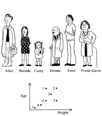
|
How do you know which point on the graph represents which person?
Note that the Height is the x axis and the age is the y axis.
You use the combination of the person's visible age and height to find
the point that best approximates them.
Why would this graph never be in a newspaper or on T.V.?
Because the information is not readily understandable and takes
some interpretation on the part of the viewer. It also takes a while
to pick out what number represents which person.
Could this graph be helpful in another situation?
This graph could be helpful in a math class where students are learning
how to apply information in the form of a scatterplot. |
But some graphs are inaccurate and misleading. There
are many ways this can happen:
-
Not starting the y-axis at zero or
using a discontinuous scale
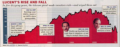 |
What is this graph about and what does it have to do with you?
This graph is about Lucent's earnings since 1996. Lucent is
a major telecom company that makes phones, computers,etc...cheaper and
better than most other companies.
On first glance, have the earnings changed lately?
They've gone down again.
Is the y axis continuous and consistant?
No, the scale is totally off--not consistant. Between 10 and
20 is a huge gap. Between 20 and 30 the gap is smaller and then between
70 and 80 the gap is the smallest.
What is this graph trying to trick you into believing?
The graph is trying to trick me into believing that Lucent didn't
make or lose as much money as they actually did make and lose. |
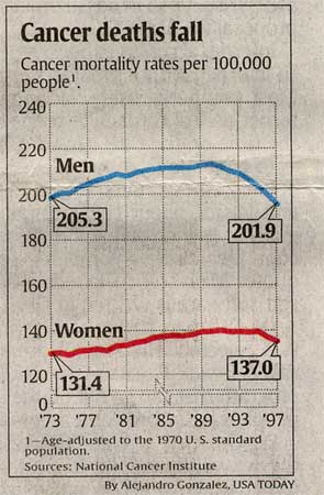
|
What is this graph about and why is it relevant to you?
This graph is about the numbers of people in the United States who
get cancer. I am a person in the United States who could get cancer.
On first glance, do more women or men get cancer? Is that true
after a closer look?
On first glance it looks like a lot more men get cancer than women,
but after looking closer, we see that there is a huge gap between 0 and
120 on the y- axis and in fact, the rates are more similar.
How is this graph tricking you?
It makes me think that a lot more men get cancer than women and
that a lot less men get cancer now than before, but more women are getting
cancer now than before.
How could we fix this graph?
Make the y axis continuous and make it start with zero. |
-
Using 2D, 3D effects to misrepresent
a situation
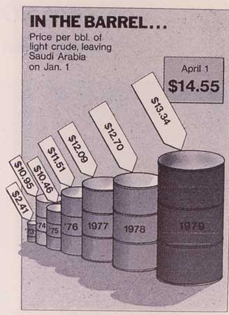 |
What is this graph about and how does it relate to you?
This graph shows the changing prices of crude oil. America
uses crude oil to produce energy in many ways including to make gasoline
for our cars.
Why do the barrels for 1973 and 1974 look so little and the graphs
for 1978 and 1979 look so big?
Because the picture is 3D, the drawer can make some barrels look
bigger or smaller depending on where they are in the picture.
How are they trying to trick you?
The graph exagerates more recent oil price jumps and doesn't make
earilier jumps look as big.
Who would try to trick you in this way?
Anyone who wanted us to think that price hikes in crude oil
are bigger than they really are--especiallly recently.
How can you make this graph accurate?
With a simple bar graph or line graph |
-
Using graphs without units

|
What is this graph about?
Itch Relief by using Lanacane.
What is the graph trying to tell you?
That Lanacane is a lot better at stopping itch relief than Hydrocortisone
after one minute and after 60 minutes.
How much better is Lanacane?
We don't know. There are no units or specifications on the
graph to tell us.
How is this graph trying to trick you?
It wants us to believe that Lanacane is a lot better than Hydrocortisone
for stopping itching, but they aren't really giving us any facts or data--it's
just a graph that they made up.
Who would try to trick you?
The people who are trying to sell Lanacane.
How can you graph this subject fairly and informatively?
By taking a poll of itchy people who have tried Lanacane and Hydrocortisone
on different itchy spots and seeing if they prefer Lanacane after one minute
and after 60 minutes. Then graph the info on a bar graph.
|
-
Using graphs with unclear sets of data
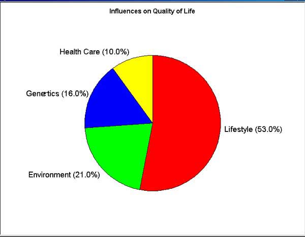 |
What is this graph about and how does it relate to your life?
The graph is about the things that influence the quality of my life.
What influences the quality of your life the most according to the
graph?
My lifestyle.
What does that mean?
We don't know. The graph doesn't tell us.
Do we know what the graphers ment by "Lifestyle" or "Genetics" or
"21.0%" or "10.0%" or do we have to make stuff up that explains each of
the quantities in order to interpret this graph ?
We have to make stuff up. This is a terrible graph.
It is useless. |
Learning
to Graph From Perspectives:
be able to graph any data set from
any relevant point of view using a journal of environmental science set
of data and...creating correct and misleading graphs
*Note to Teacher*
THIS SHOULD BE DONE IN SMALL GROUPS
We have seen how bar graphs, pie charts, histograms,
scatterplots, and line graphs can be used in the media. We are going
to focus on line graphs and scatterplots in the activity since that is
what students are learning in Algebra. Specifically, we are going to fit
data points to a linear model in several different ways. This skill
should have been taught in Algebra class.
Since after graphing this set of data, students would realize that
people get cancer without even being exposed, they should realize that
the Journal of Environmental Health would want to make it appear that all
the people in the area (or a much higher percentage) got cancer from the
Atomic Energy Plant. To do this, the Y-axis should start at one of
the data points with the lowest y value (not starting the y- axis at zero)
which would make the graph seem to say that anyone who is not exposed will
probably not get cancer and anyone who is has a greater chance of getting
cancer. The graph's y axis should probably be in cases of cancer
per 100,000 residents (written in small print under the graph) so that
the number of people with cancer will appear to be more than it actually
is. In the case of the Atomic Energy Plant, the y axis should start
at zero to show that even with no exposure (x=0), 115 people will still
die from cancer per 100,000. Such a graph will make deaths
from hazardous waste look relatively small. The atomic energy plant
could also want to change the # of deaths from cancer per 100,000 to the
% of deaths from cancer because those numbers would look smaller and make
the energy plant look better.
The actual line of best fit for this data is y=9.27386419x + 114.681626.
This means that with an exposure of zero (no exposure) 115 people will
still die of cancer per every 100,000 and for every increase of one in
the exposure index(like from an index value of 1 to 2, or 8 to 9, etc...there
will be a constant rate of increase of approximately 10 more deaths per
100,000 people.
[Data contributed by Dr. Mary Beth Searcy, Appalachian State University]
The table of data below was taken
from an article in the Journal of Environmental Health, May-June 1965,
Volume 27, Number 6, pages 883-897. The article explains that the
Hanford, Washington, Atomic Energy Plant has been a plutonium production
facility since World War II. Some of the wastes have been stored
in pits in the same area. Radioactive waste has been seeping into
the Columbia River since that time, and eight Oregon counties and the city
of Portland have been exposed to radioactive contamination. Research
was conducted to determine what correlation existed between the area residents'
exposure to the radioactive contamination and deaths from cancer.
The table lists the number of cancer
deaths per 100,000 residents for Portland and the eight surrounding counties.
Also provided is an index of exposure that measures the proximity of the
residents to the contamination. Use the information that you have
learned about how people can use graphs to manipulate a data set.
Make a graph for each portion of the assignment. Include a justification
for each graph and how it should be used in popular media to convey the
information it portrays.
(1) Make a graph that the
Journal of Environmental Health would want to publish.
-
What would the Journal of Environmental
Health want people to think about the relationship between the closeness
to the energy plant pollution and the number of deaths from cancer?
-
Which graph (bar graph, line graph,
scatterplot, pie chart) would be appropriate in this situation and would
make the data best fit their claim? How can you further manipulate
the graph to make the data best fit their claim?
-
How would you publish this graph?
(2) Make a graph that the Atomic
Energy Plant would want to publish.
-
What would the Atomic Energy Plant
want people to think about the relationship between the closeness to the
energy plant pollution and the number of deaths from cancer?
-
Which graph (bar graph, line graph,
scatterplot, pie chart) would be appropriate in this situation and would
make the data best fit their claim? How can you further manipulate
the graph to make the data best fit their claim?
-
How would you publish this graph?
(3) Make a fair representation of the
data below.
-
Does this graph more closely resemble
graph (1) or graph (2)?
-
What conclusion do you draw from the
data set? (Is there a very high correlation between cancer and radioactive
waste in these towns?)
-
Can you say for sure that radioactive
waste has caused cancer in these towns? Why or why not?
(4) Present this information in the
form of either:
-
a powerpoint presentation of each graph
and its justification or
-
a videotaped news broadcast or debate
between the Atomic Energy Plant and the Journal of Environmental Health
using the graphs as justifications for each side's argument (this choice
needs a signed permission slip for everyone in the group)
|
County/City
|
Index of Exposure
|
Deaths
|
|
Umatilla
|
2.5
|
147
|
|
Morrow
|
2.6
|
130
|
|
Gillian
|
3.4
|
130
|
|
Sherman
|
1.3
|
114
|
|
Wasco
|
1.6
|
138
|
|
Hood River
|
3.8
|
162
|
|
Porland
|
11.6
|
208
|
|
Columbia
|
6.4
|
178
|
|
Clatsop
|
8.3
|
210
|
Extensive
Free Data Sets:
*Note to Teacher*
These Data Sets are appropriate for practice in data
analysis, quizzes, or tests.